- Products
- New Products
- Featured Products
- Color and Print Themes
- Blood Pressure Measurement
- NIBP / Vital Sign Monitors
- Digital Aneroid Sphygmomanometers
- Palm Aneroid Sphygmomanometers
- Pocket Aneroid Sphygmomanometers
- Pro's Combo Sphygmomanometers
- Multicuff Sphygmomanometers
- Clock Aneroid Sphygmomanometers
- Mercury Sphygmomanometers
- Home Blood Pressure Measurement
- Adcuff +
- Gauges
- Bulb & Valves
- Disposable Cuffs
- Reusable Cuffs & Bladders
- Sphygmomanometer Accessories
- Sphygmomanometer Parts
- Caseware
- CPR / Airway
- EENT
- Instruments & Accessories
- Laryngoscopes
- Penlights
- Pulse Oximeters
- Stethoscopes
- Thermometry
- Vital Signs Monitors
- Solutions
- About ADC
- Learning Center
- Support
- Blog
- Contact
The ADC Website Goes Mobile

Written By:
Marc Blitstein / President & CEO
Posted On:
February 03, 2017
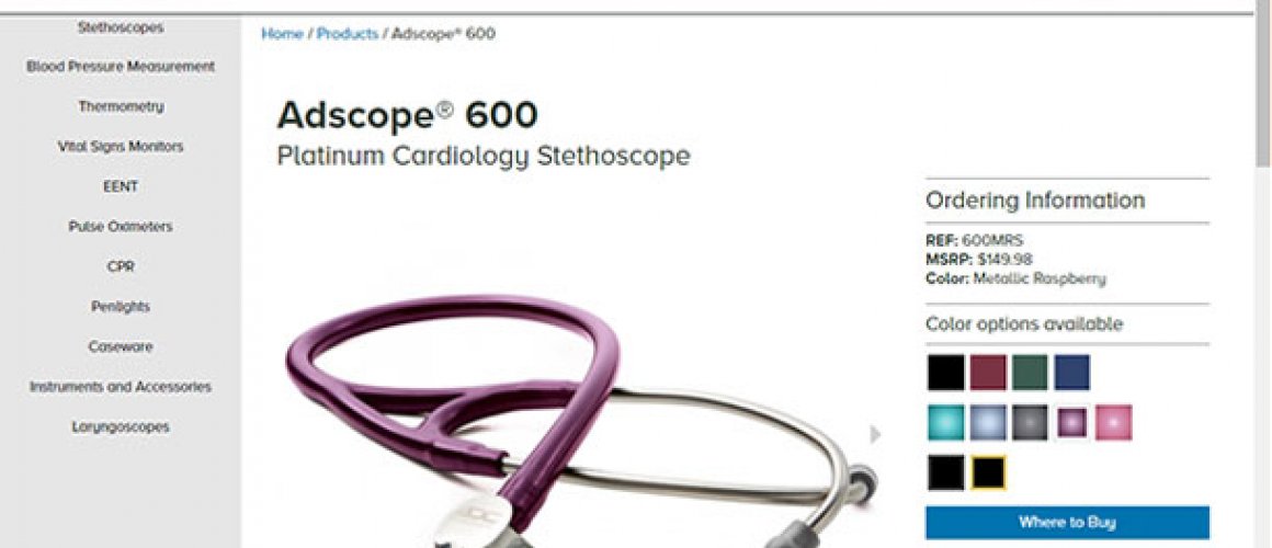
An ADC team, including our entire marketing, creative, and IT departments, spent the better part of 2016 redesigning our website to make it “mobile,” as the IT folks like to say. With a third of our web traffic now coming from mobile devices, we needed a platform that was small-screen and touch friendly. The team agonized over the appearance, from the look of the menus to the readability of the fonts. Every single photo was resized – often multiple times – optimized for the various ways they might be viewed, from thumbnail to full-screen image.
 Because our site is so content rich with many interactive features, much of the underlying technology had to be replaced. We think the new site, which we call Web 2.0 (though really our fifth iteration since 1999), is our best yet. We hope you’ll agree.
Mobile means the new site resizes itself automatically to best fit the device and screen size on which it is being viewed. Its touch and swipe responsive, though it will still respond to mouse clicks just as well. With the exception of our product builders, every interactive feature – from our color/size product virtualizers to our comparison engine to our product training guides – has been re-coded to work just as good on mobile as on a desktop.
If you haven’t visited our site lately, we invite you to spend a few minutes with us. You’ll find the most content-rich site in its class. Not only will you find more product details than anywhere else, you can view both promotional and how-to videos, deep background on ADC (after all once you buy our products you become part of the ADC family), one of the best learning centers anywhere, a download library of videos and instructions for use, an FAQ that is constantly growing in response to your questions, and a host of other features.
As always, your feedback is welcome.
